Treasury
IDENTITY
2018Designed with Studio 1212
Studio 1212 developed the brand message framework and visual identity for
Treasury, an Indonesian financial technology company & app that focuses on gold savings.
Treasury is not a conventional investment institution, but rather a "smart, simple and safe"digital innovation for Generation X and Millennials. Despite the generational gap between the two targets, identifying their "aspirations" to secure a long-term future becomes the brand's main communication.

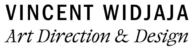
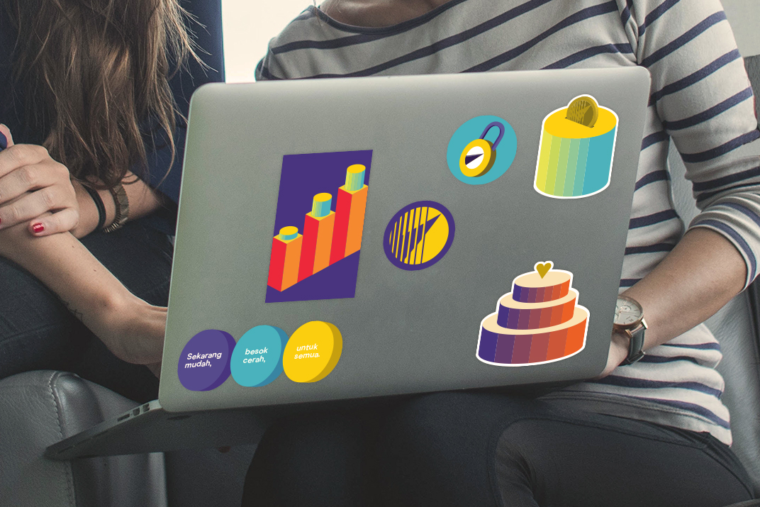
Characterizing Treasury as "human, clear and smart", Studio 1212 developed a logo inspired by a timeless symbol for currency, the gold coin.
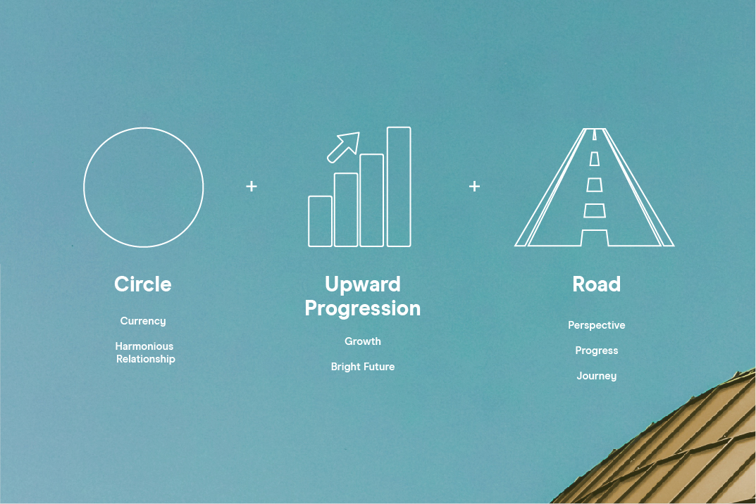
To balance the classic approach of the logo, we paired it with a friendly typeface and a vivid, energetic color palette.
This identity is then applied to Treasury’s app icon, stickers, stationery, and other promotional items.


ROLE:
Responsible for developing logo concepts, graphic illustrations, and design applications from the brief under supervision of art director.
Wastu
IDENTITY
2017Designed with Studio 1212
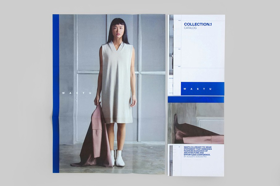
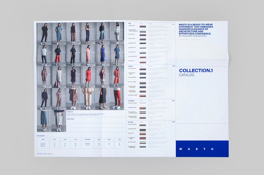
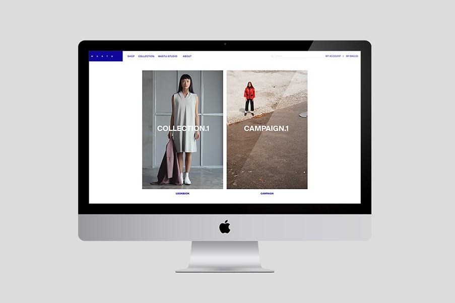
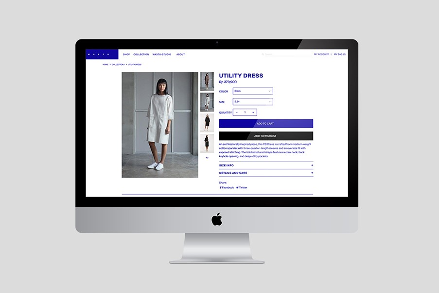
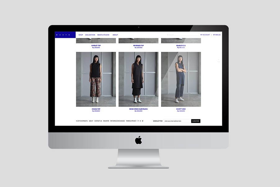
Founded in 2017, Wastu is an Indonesian ready-to-wear brand specializing in the elegantly understated piece and crafted from the ideas of an Indonesian fashion designer, Auguste Soesastro.
Taken from Javanese Sanskrit, Wastu means 'Architecture', which has been Auguste's interest and has inspired him to harmonize architectural lines, geometry, and structures into wearable items. Wastu embodies a way of life in stylish collections affordable for any budget.

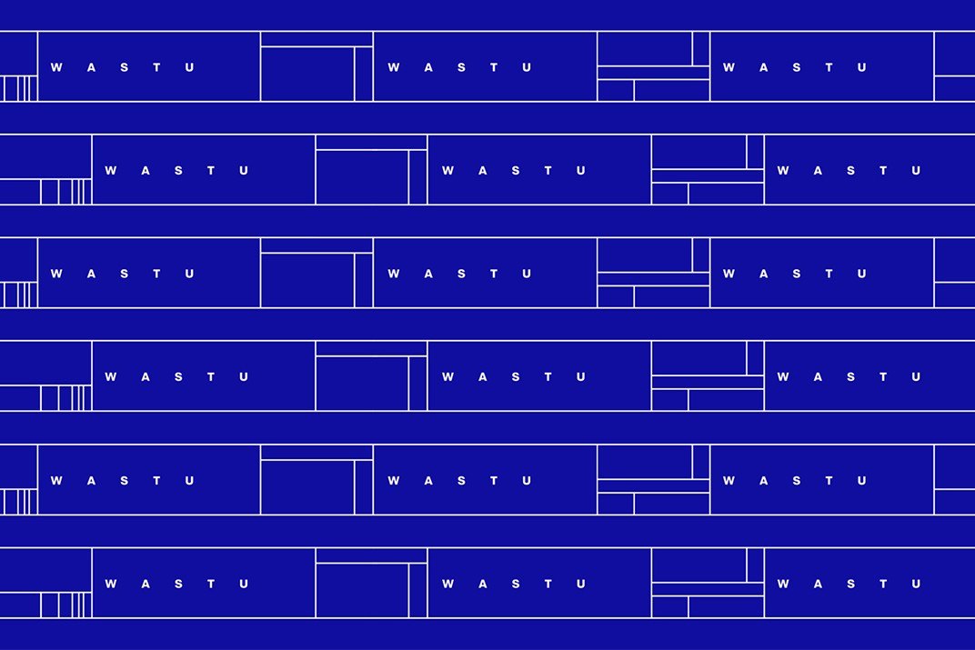


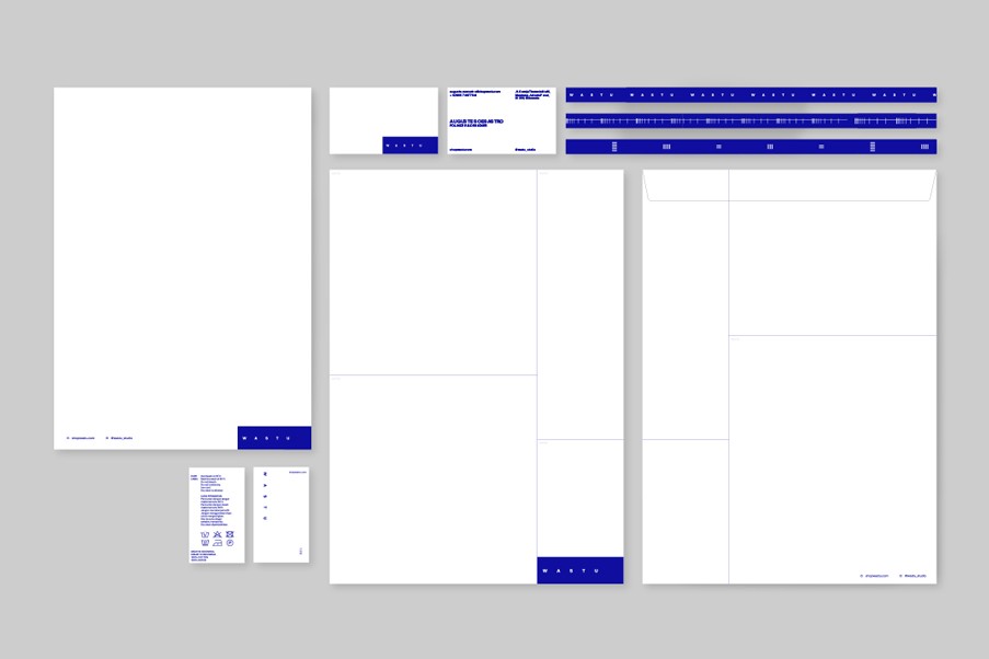
On architectural blueprints, almost the entire drawing is a technical illustration of an architect’s vision. However, the only presence of the architect is found in the bottom corner of the page, where the firm’s signature is contained in the technical information grid template. For the identity mark, we created a signature grid inspired by the Golden Ratio as an homage to the architectural inspiration of the brand.
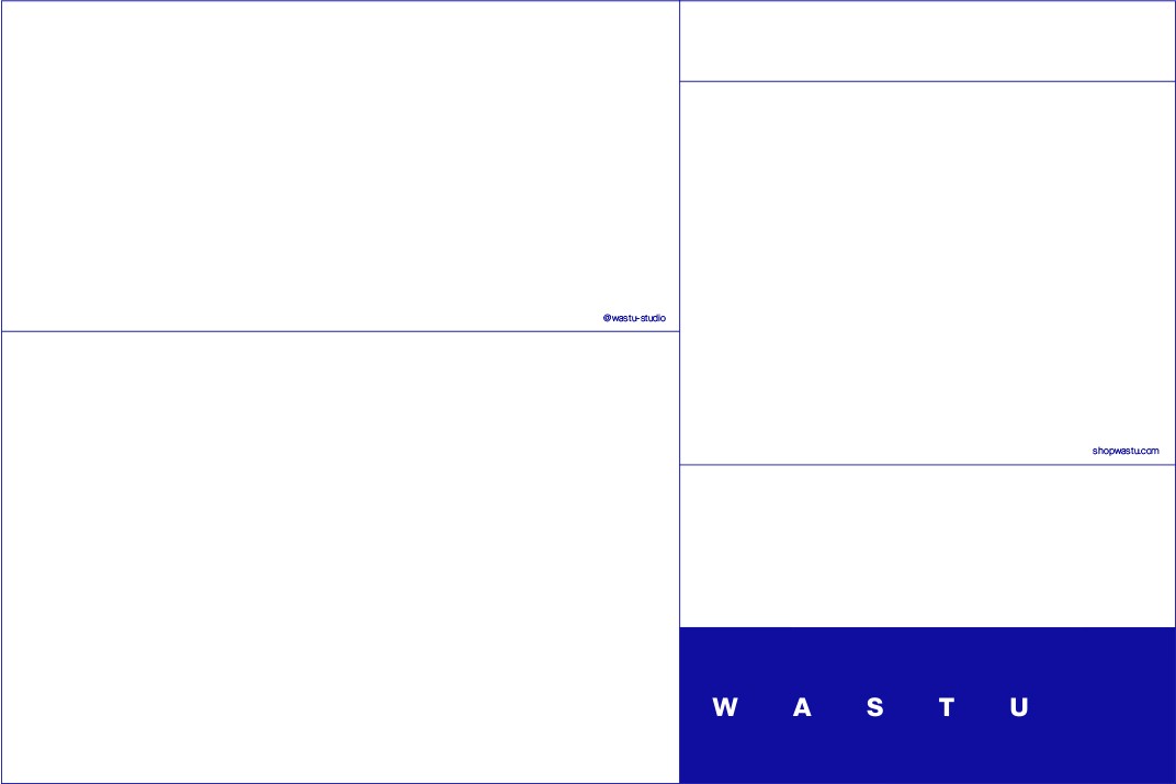
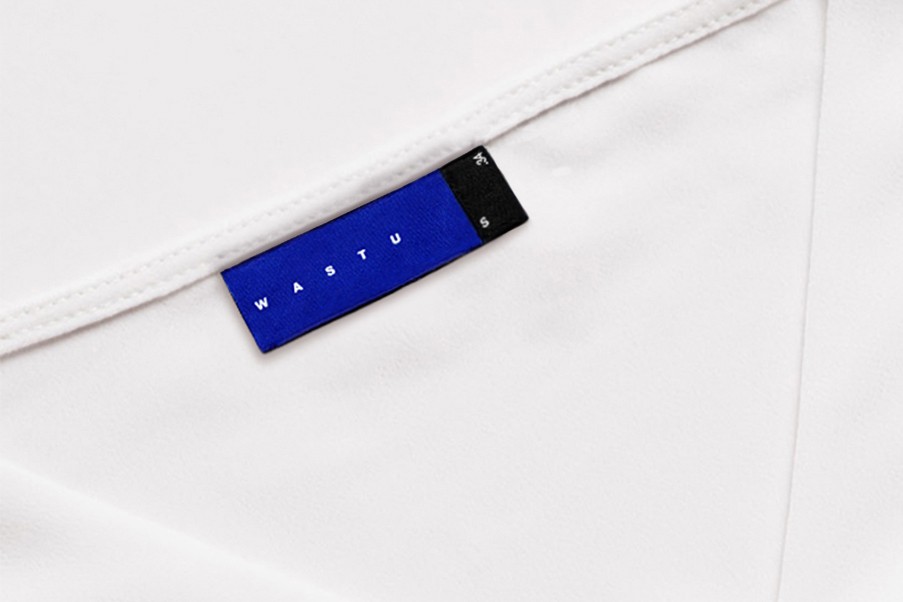
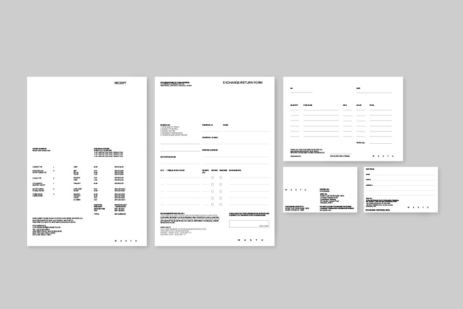
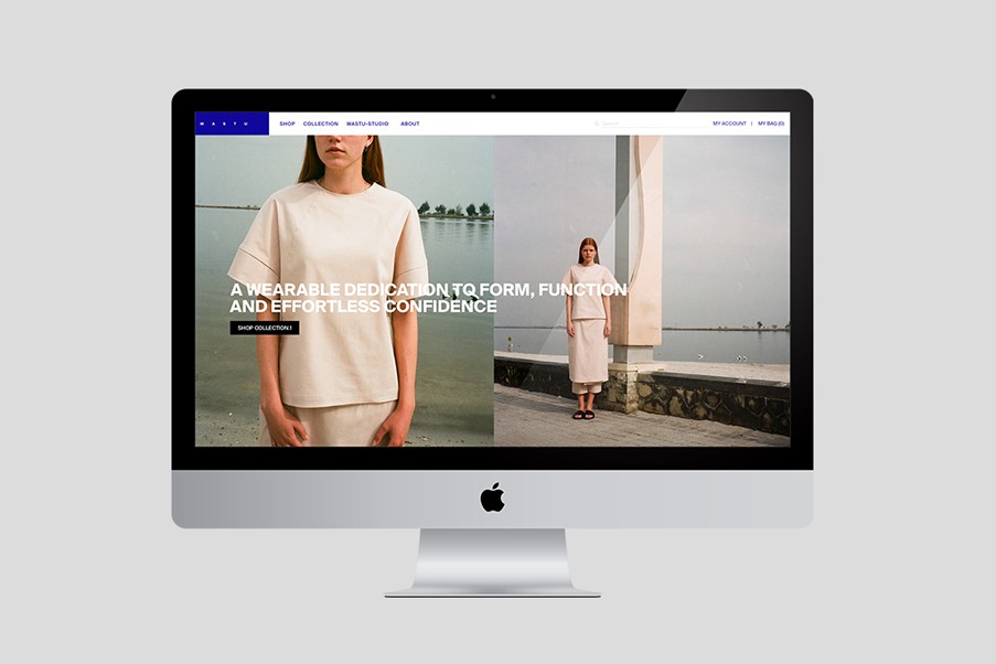
Influenced also by Bauhaus principle of 'form follows function', we reinforced the concept and brand communication through design applications such as clothing tags, printed matters, website, and branded print/digital campaign for the collection debut.
Lookbook Credits:
CAMPAIGN.1
Photographer: Leandro Quintero
Stylist: Karin Wijaya
COLLECTION.1 [Lookbook]
Photographer & Stylist: Wastu & Bobobobo Teams


![CAMPAIGN.1 [Print]](https://freight.cargo.site/t/original/i/9fe17c8a3d5c61bc90704d0519b1ceb78a2444f74ecd80a6862cf379288ca588/1-.Wastu-Catalog_zoom_Resized.jpg)
![CAMPAIGN.1 [Print]](https://freight.cargo.site/t/original/i/62717baf4986fc75f4987ac721e0db34cef084976f2c56e6f3d04a650b632c52/Wastu_CatalogCampaign_1.jpg)
![CAMPAIGN.1 [Print]](https://freight.cargo.site/t/original/i/b90417e41700e81fc54db65d021fab6de037b4c32603a8d5049137d6fec493e2/Wastu_CatalogCampaign_2.jpg)
![CAMPAIGN.1 [Print]](https://freight.cargo.site/t/original/i/1f3463d641cd4d4784ca28422b3463be246f4965cfd10bd88242cd53557ee640/Wastu_CatalogCampaign_3.jpg)
![CAMPAIGN.1 [Print]](https://freight.cargo.site/t/original/i/3da9c4ab68e7cfbb02e5c9b292f7275584f3fde53f74b67512bb12bb5e6e0e4e/Wastu_CatalogCampaign_4.jpg)
![CAMPAIGN.1 [Instagram]](https://freight.cargo.site/t/original/i/3c580d16f92319c6b8f716fcf93a0f07cfe4883ec26614d7f1f4047ab5acd27a/1.-Wastu_InstagramContext_Resized.jpg)
![CAMPAIGN.1 [Instagram]](https://freight.cargo.site/t/original/i/b31599c42b85dd9f33c48deb55d886c2be6fbb38d8798332310a8f5e2249654e/Wastu_Campaign_10.12.jpg)
![CAMPAIGN.1 [Instagram]](https://freight.cargo.site/t/original/i/a803a22719abe5baa9dec239760b18d684d86fc5cdc4554a17513498576b3910/Wastu_CatalogCampaign_6.5.jpg)
![CAMPAIGN.1 [Instagram]](https://freight.cargo.site/t/original/i/0ba2cd9ae6b7b649af19856213242021e9ff728395b540b19e640e937b458412/Wastu_Campaign_12.5.jpg)
![CAMPAIGN.1 [Instagram]](https://freight.cargo.site/t/original/i/11978a80c4e542ea86eb35ba4b1870ec4c8de4a90b05360cf381032488b4382e/Wastu_CatalogCampaign_8.jpg)
![CAMPAIGN.1 [Instagram]](https://freight.cargo.site/t/original/i/91610ced4b5c49e6292f47f0b21ba8401876042bd511bb9f3798aca0b8e8d99a/39.-Wastu_Campaign_Unpublished_5.jpg)
ROLE:
Worked closely with creative director to develop name proposals,
logo concepts, and design applications. Also, worked with web developer.
TEAM:
Creative & Art Direction: Max Suriaganda
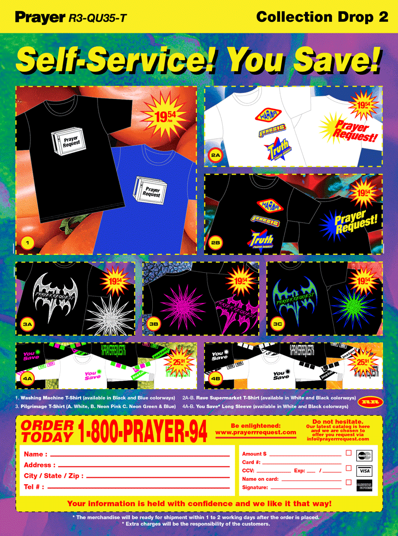
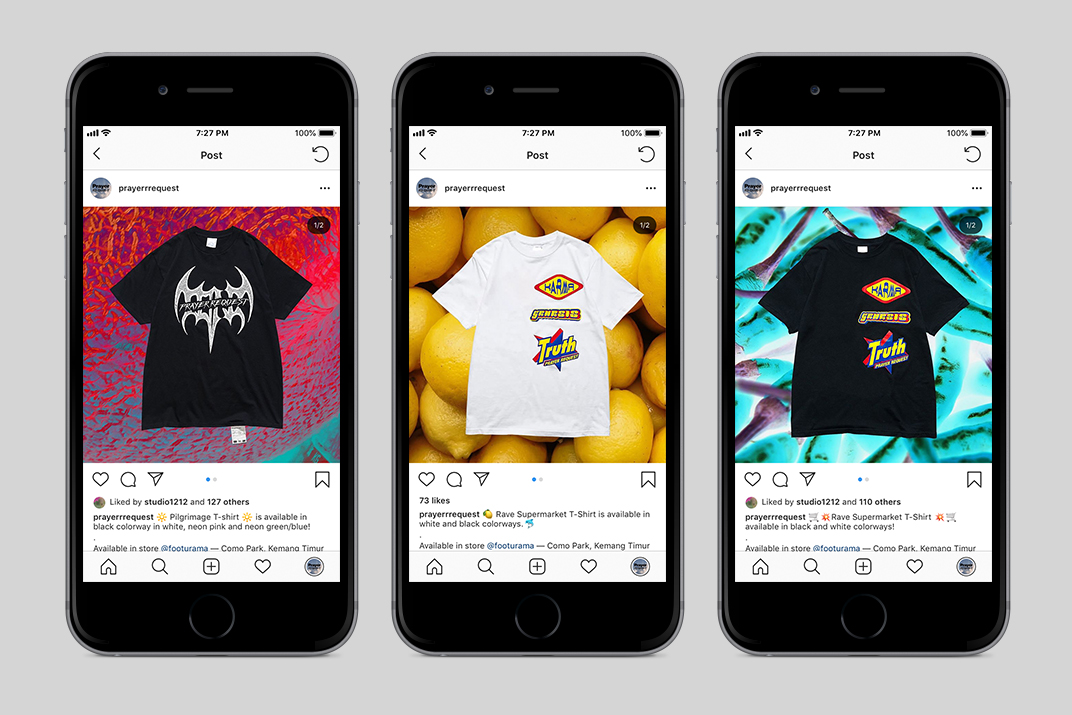
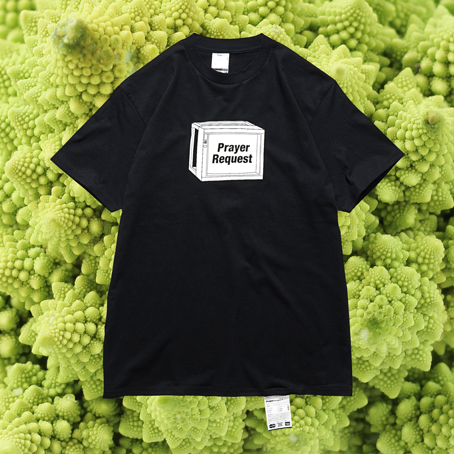
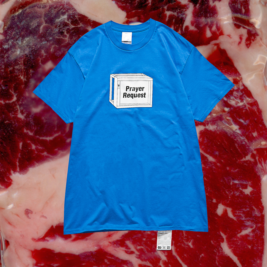
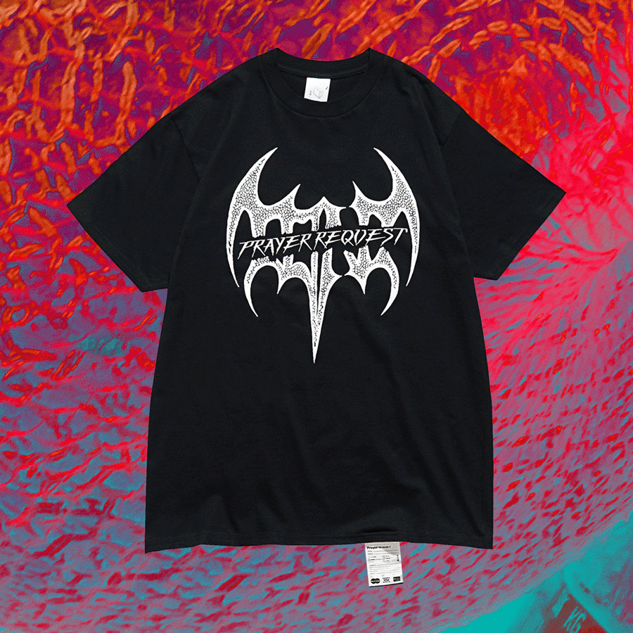
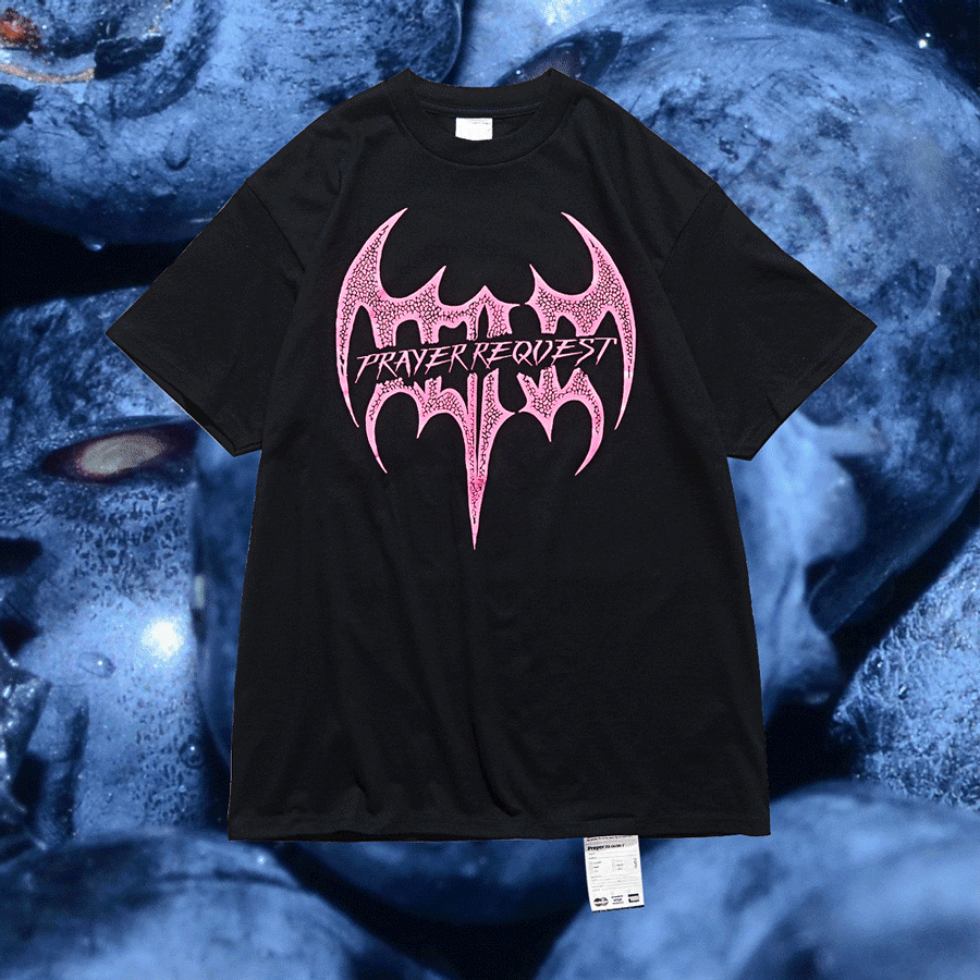
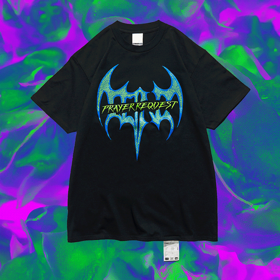
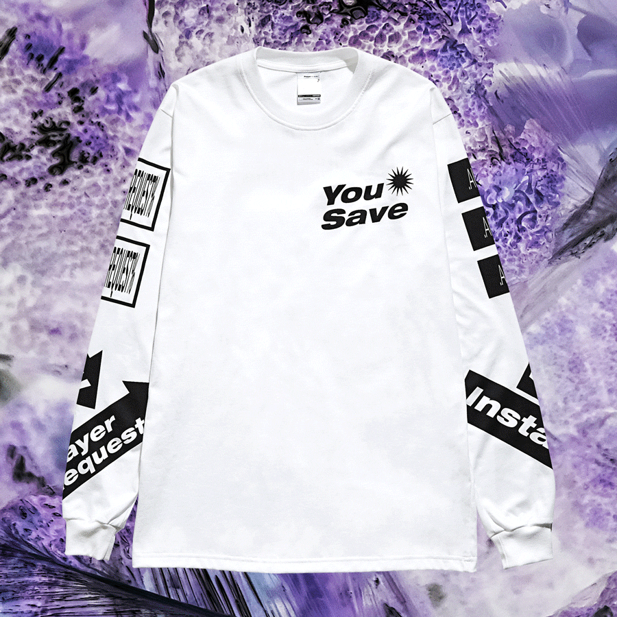
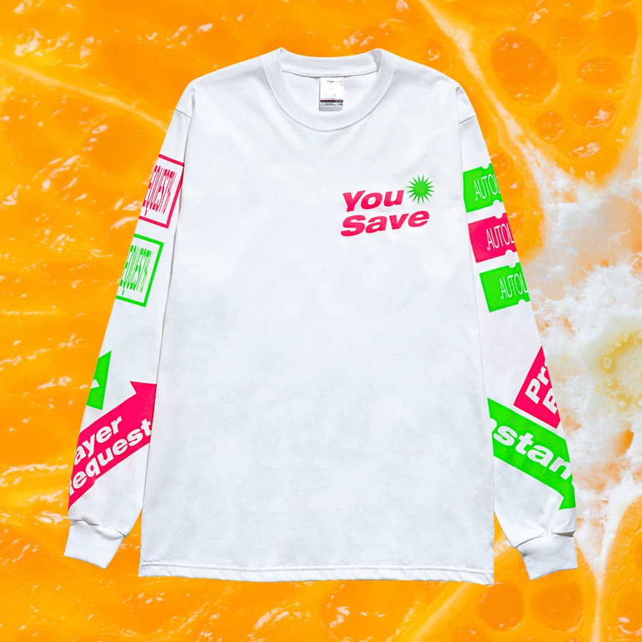
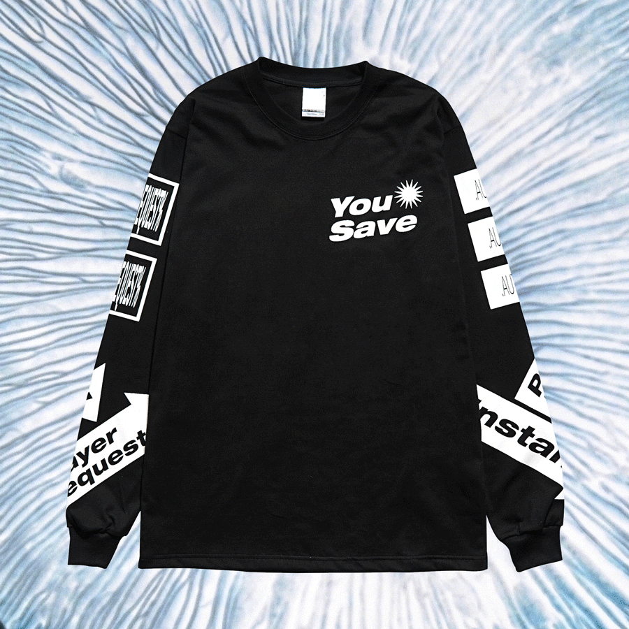
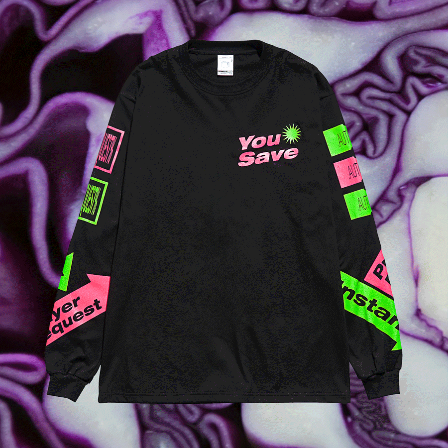
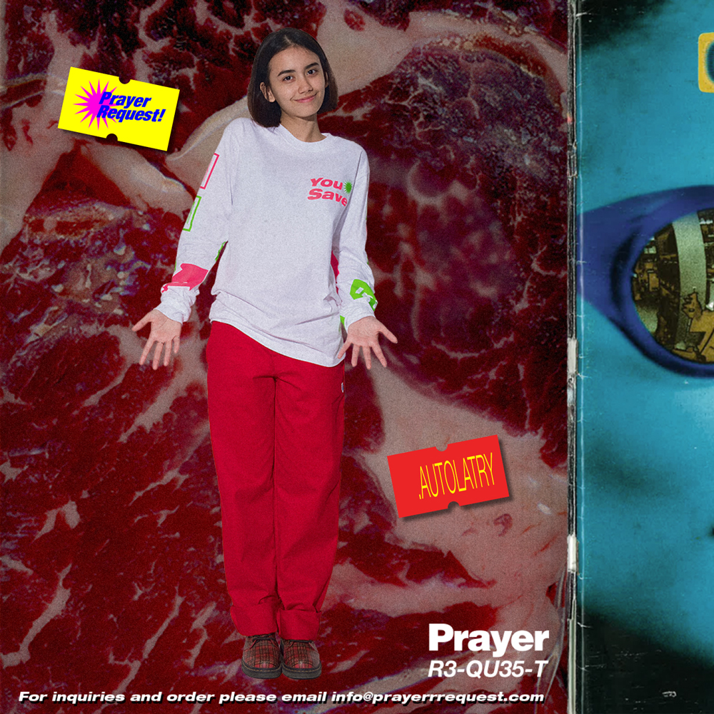
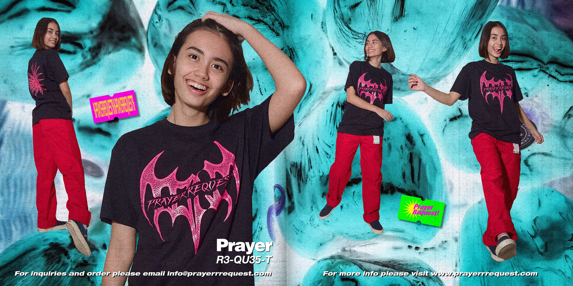
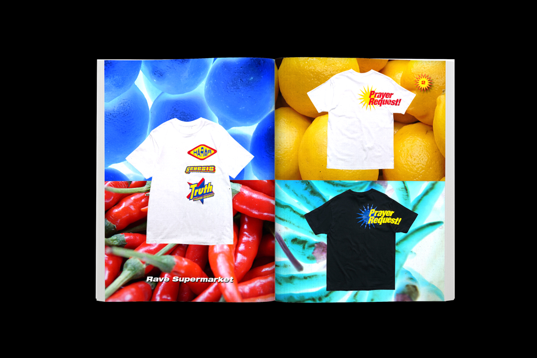
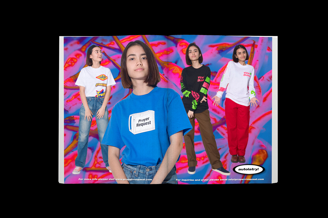
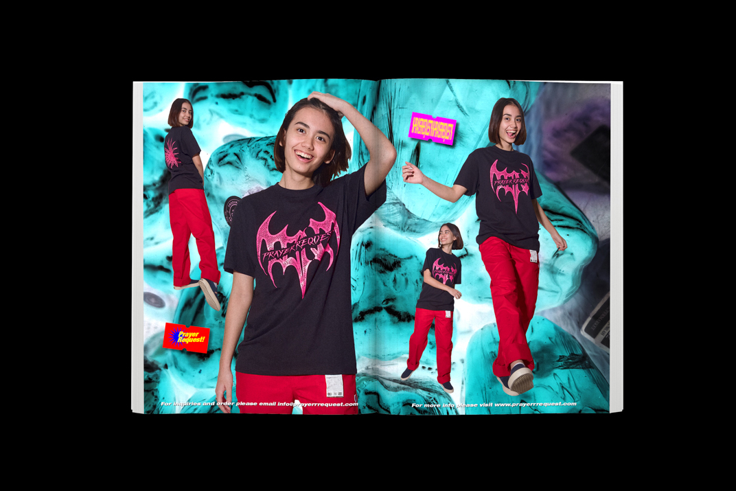
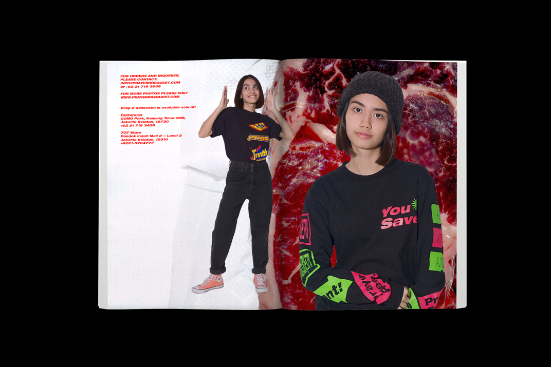
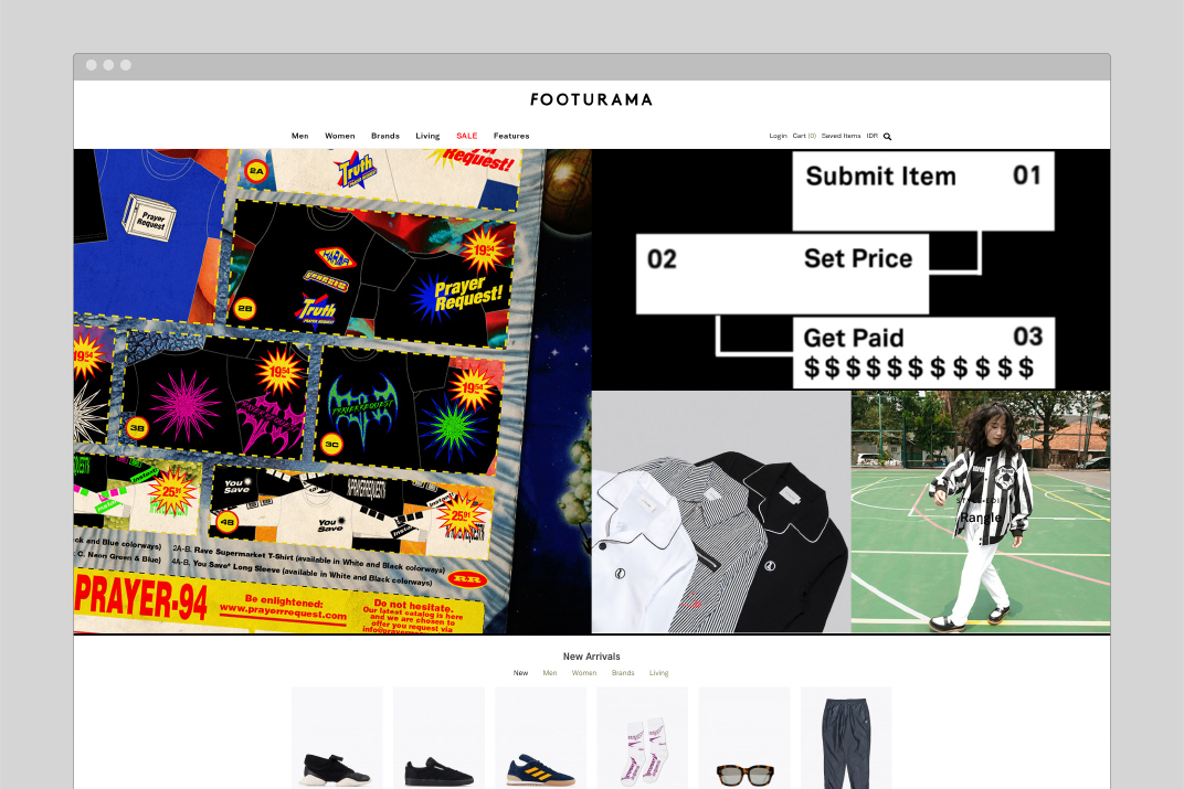
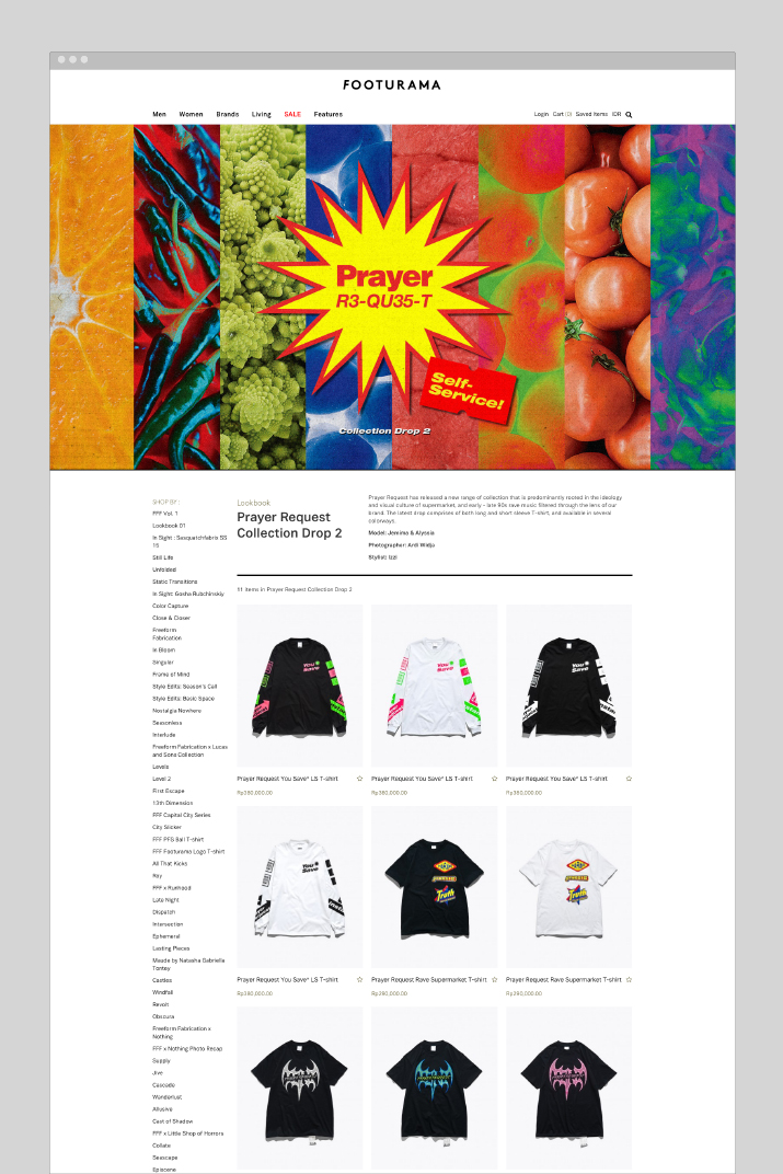
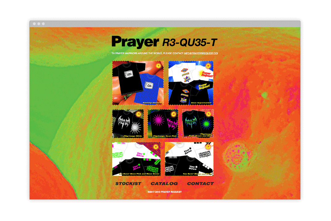
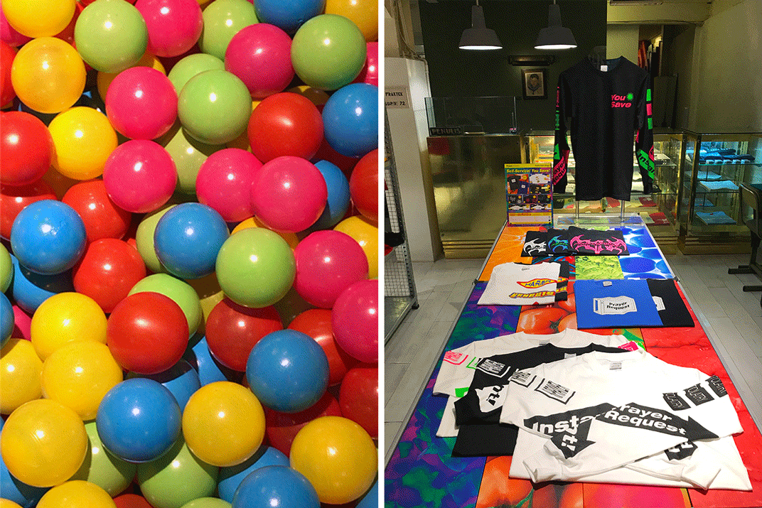
Prayer Request – Drop 2
IDENTITY
2017-2018Designed with Footurama and Studio 1212
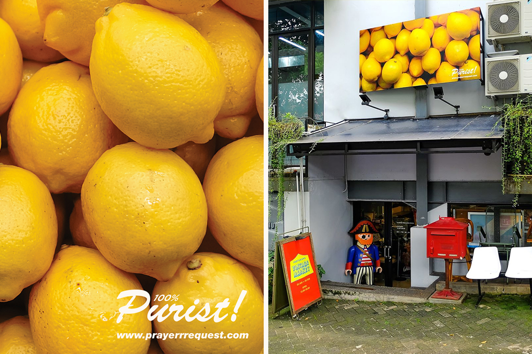
Prayer Request is an apparel line inspired from the visual "blind-spot" and zeitgeist of the 90s youth and sonic subcultures – a nod to one's own cathartic enlightenment and a response towards authoritarian and proprietary conducts.
The brand's second drop collection is predominantly rooted in the ideology and visual culture of supermarket, and early - late 90s rave music filtered through the lens of the brand.


![Lookbook Catalog [Front]](https://freight.cargo.site/t/original/i/05700ef12d220155826d2f0fbf828644fab92380f7cfb8cee59a96980ecb05e3/2.jpg)
![Lookbook Catalog [Spread Samples]](https://freight.cargo.site/t/original/i/905ce5880dc084ab5513b05eccf61da27eea56b0c77f4e5d1ded2df513182de1/3.jpg)

![Lookbook Catalog [Back]](https://freight.cargo.site/t/original/i/39286322a82153912015b19d46efd97ccea42ad2495508334f51fb8929314838/25.jpg)

Click here to view the full lookbook catalog.
Instagram: @prayerrrequest
Website: www.prayerrrequest.com
ROLE:
Researched and proposed brand's naming and concept to creative director. Additional research for visual assets and moodboards. Responsible for the design development of the second drop collection (except for the Washing Machine T-shirt), and also the collection's names, communication, moodboard, and digital campaigns on Instagram, and digital catalog.
TEAM:
Creative Direction: Max Suriaganda
Logo/Web Coding/Drop 1 Collection/Washing Machine T-Shirt: Ratta Bill
Production: Adityo Cahyo
Photography: Ardi Widja
Stylist/Model Scout: Izzi Husaini
🙏🏻 Made in Indonesia 🙏🏻
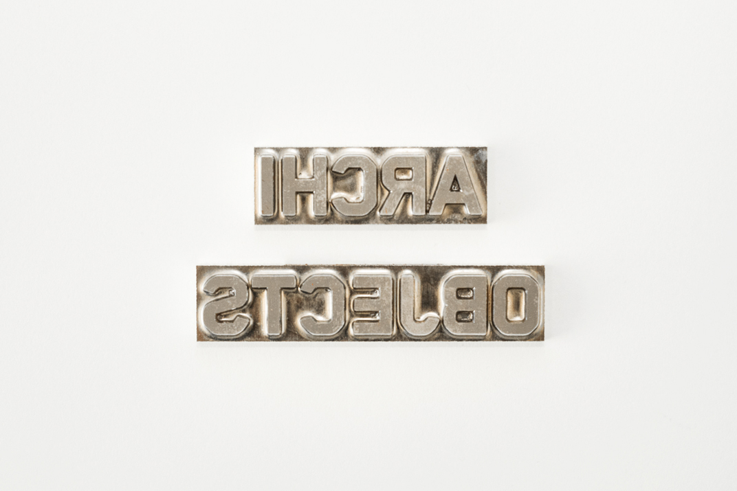
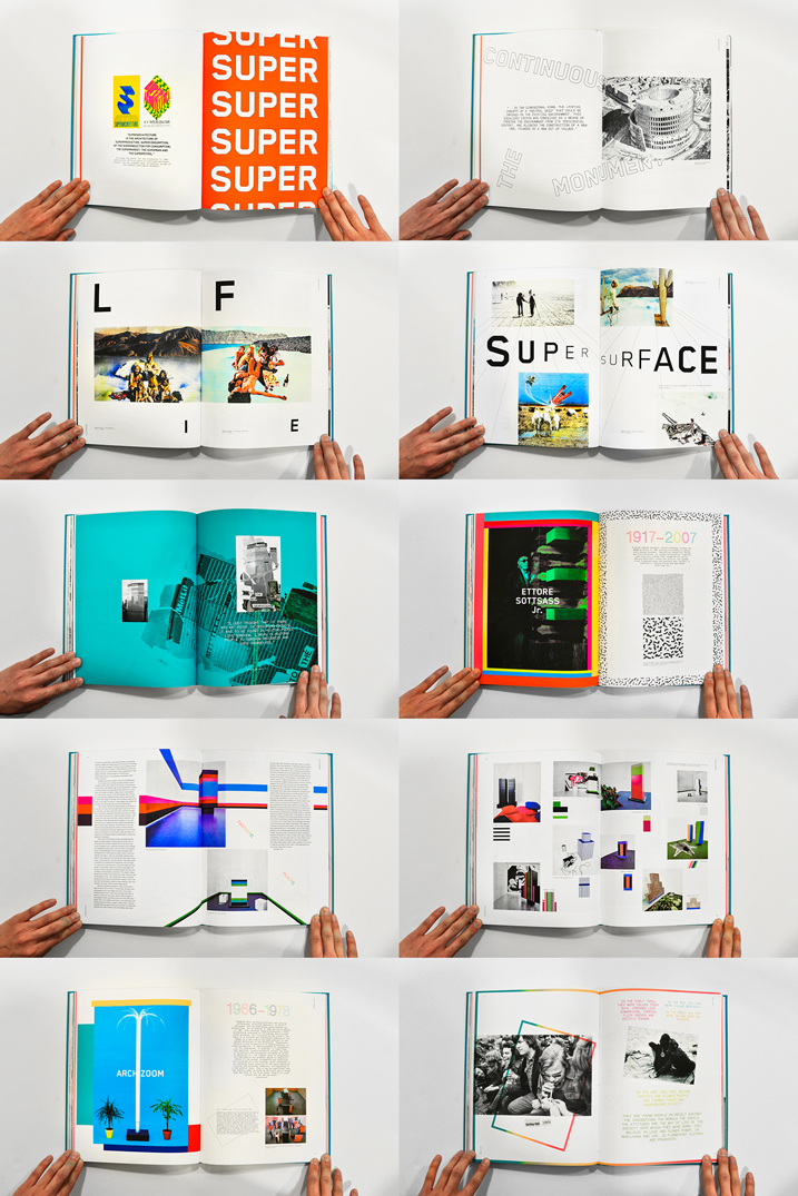
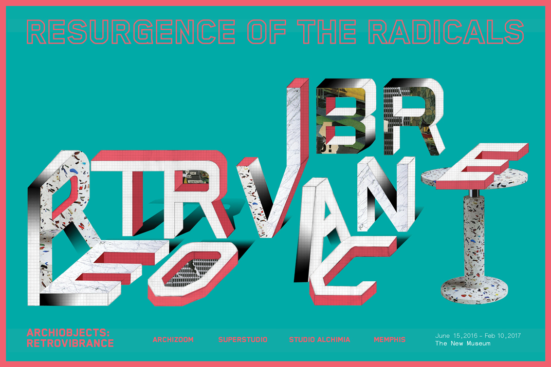
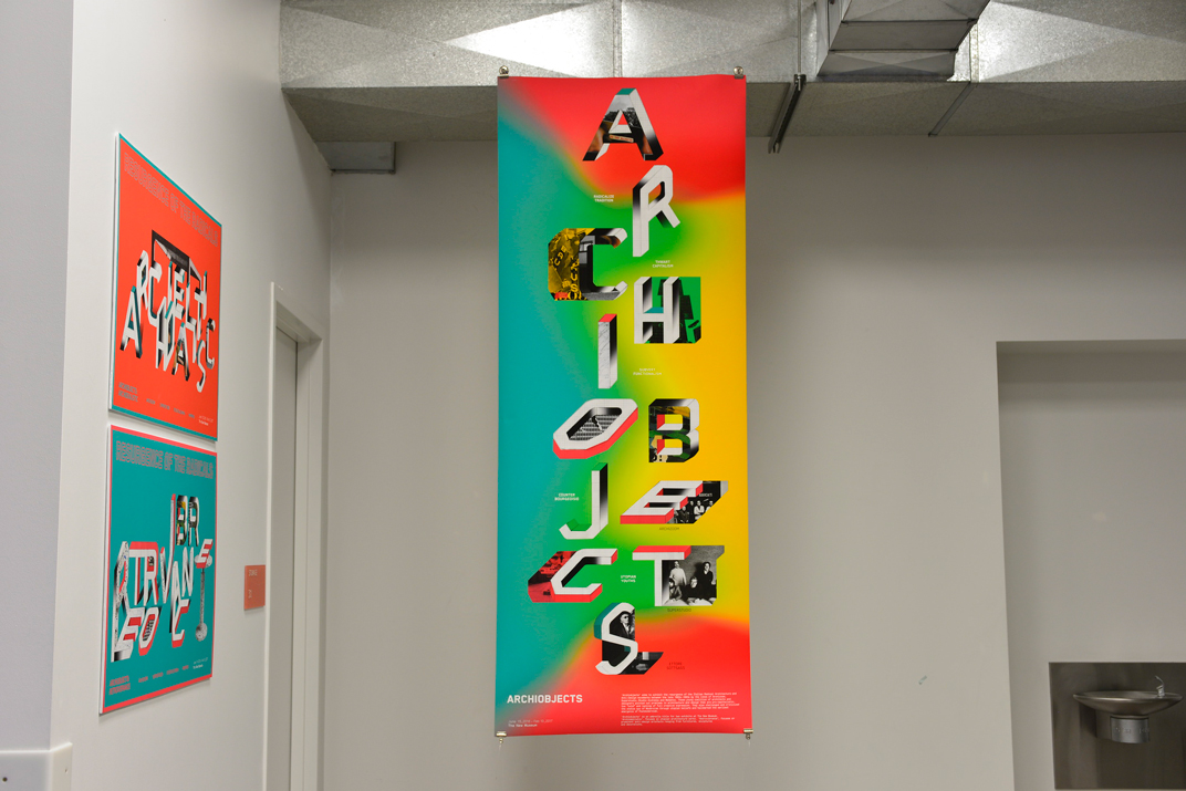
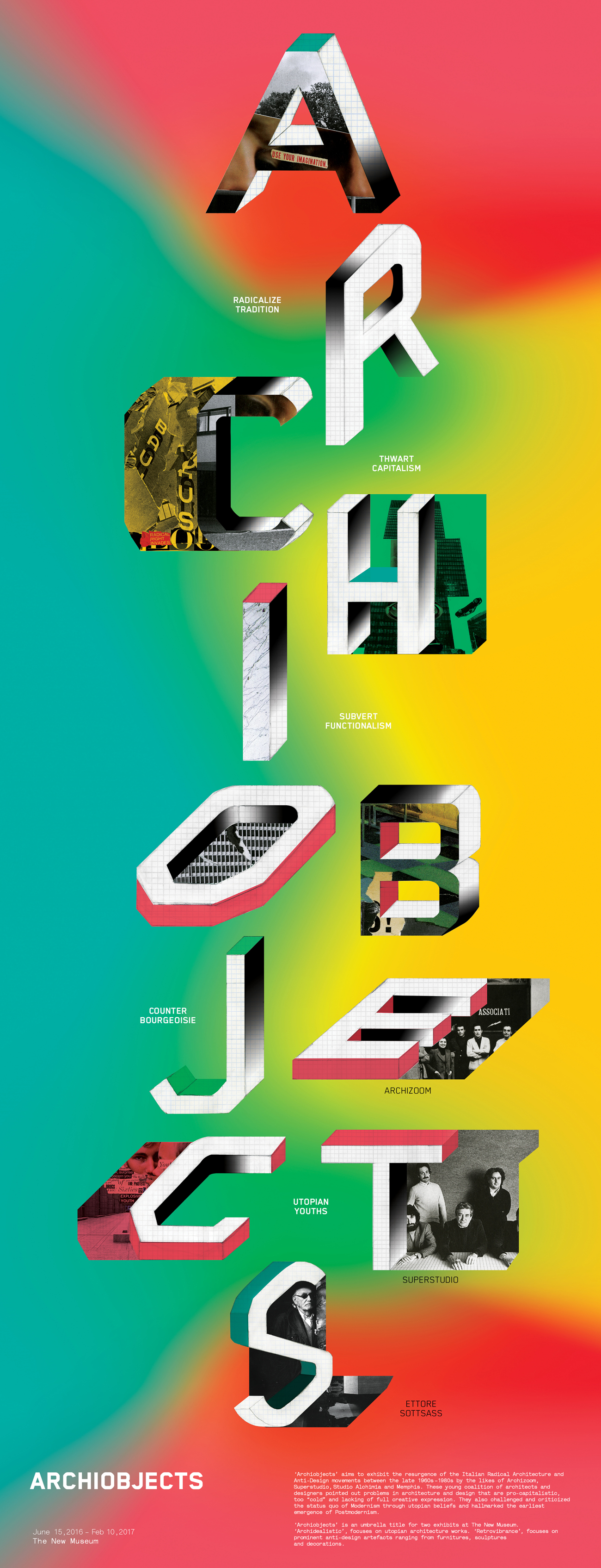
Archiobjects
CONCEPT PROJECT – BOOK DESIGN/IDENTITY
Spring 2015Done as a student project at ArtCenter College of Design during the course of 14 weeks.
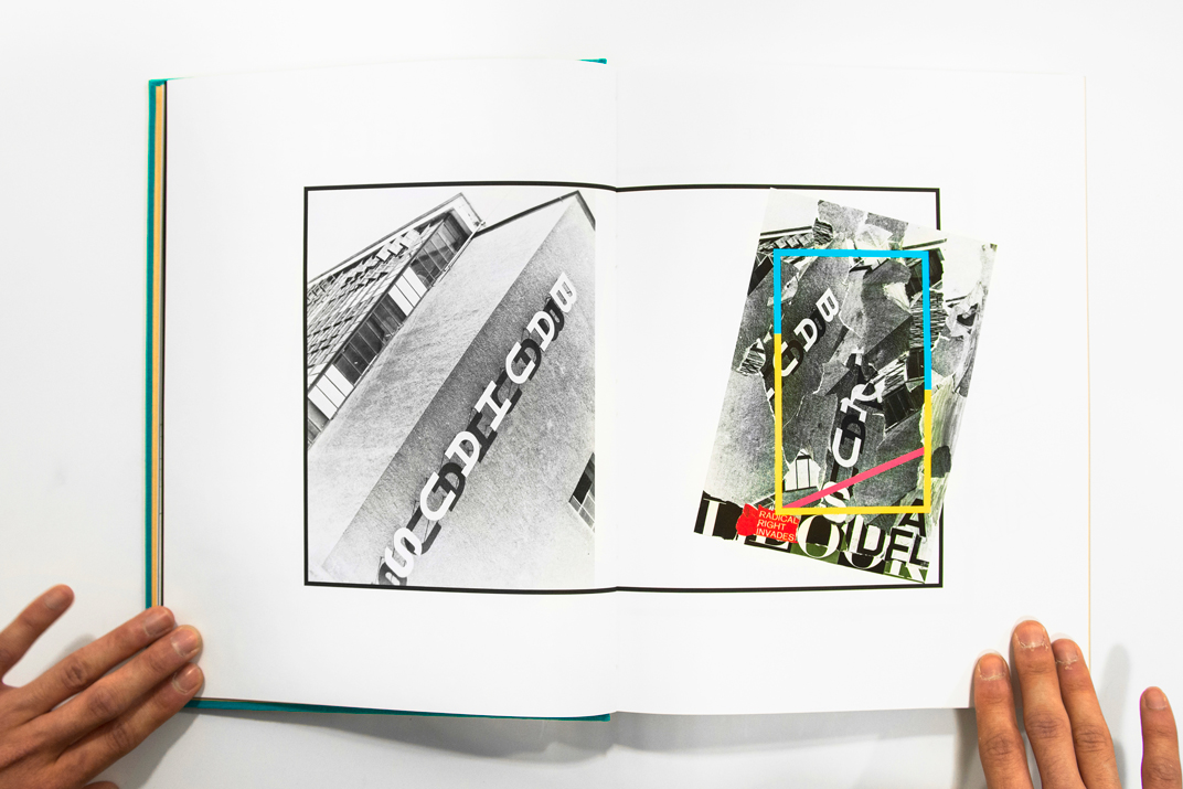
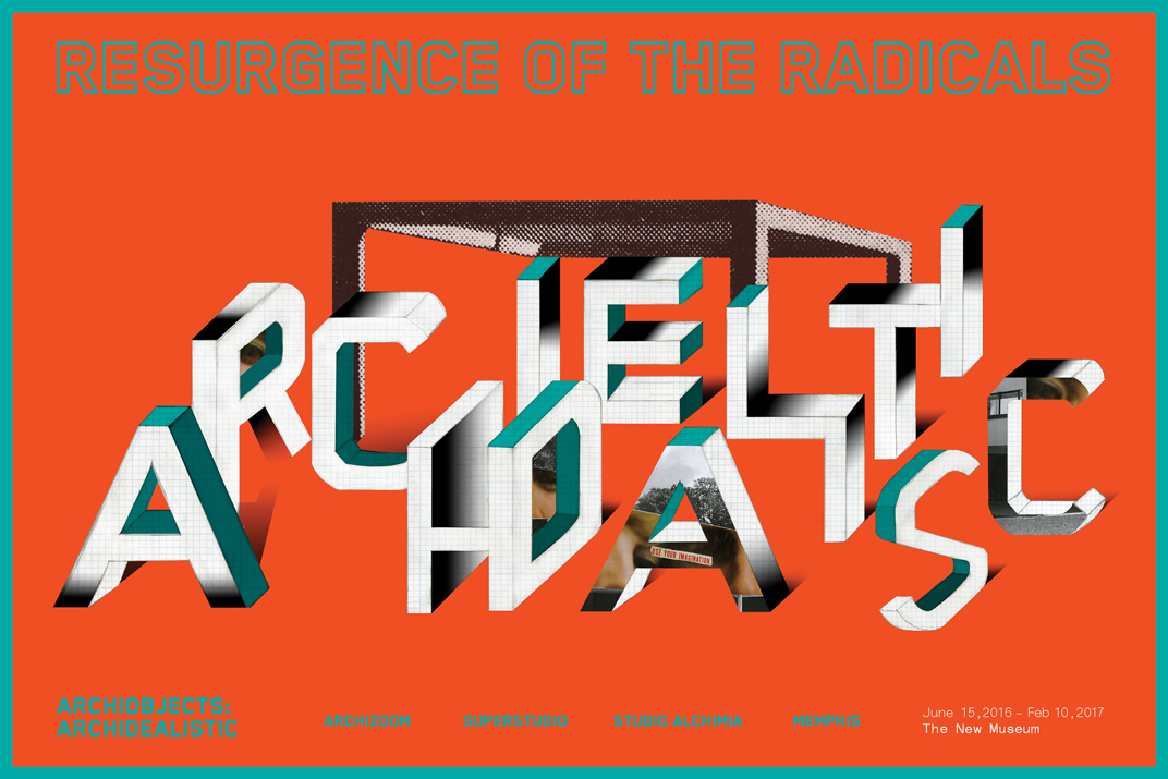
A 256-page book that celebrates the short-lived Radical Architecture and Anti-Design movements originated in Italy between the late 1960s–1980s. The book looks into the works, narratives, and responses of prominent radical Italian architects and “anti” designers, such as Superstudio, Archizoom, Studio Alchimia, Memphis and Ettore Sottsass.
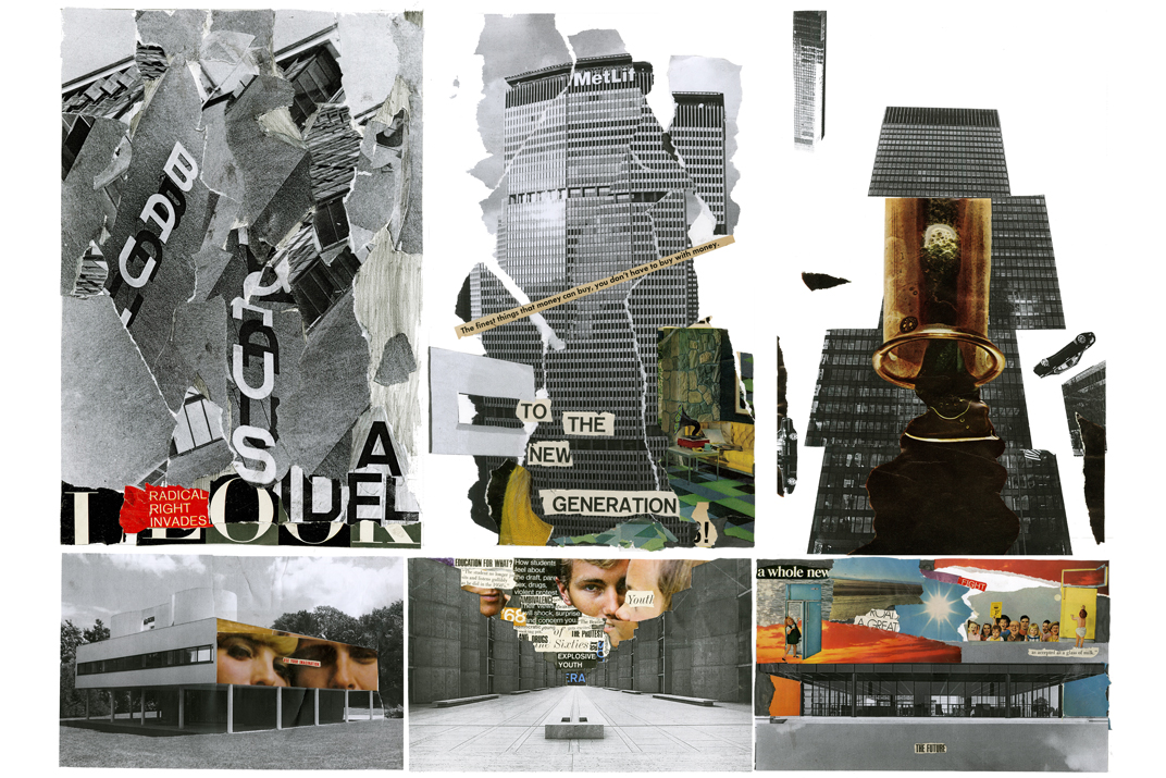
The design approach of this book reflects the movements idealistic-utopian beliefs channeled through photomontages and colorful objects that point out problems in Modernism architecture and design—specifically the Bauhaus. Also inspired by the expressive, freewheeling lifestyle of the hippie 1960s that influences the movements.
The book illustrates a resurgence of these movements back to the contemporary era, and how they triggered the emergence of Postmodernism that impacted the contemporary design culture and thinking today.
Instructor: Brad Bartlett


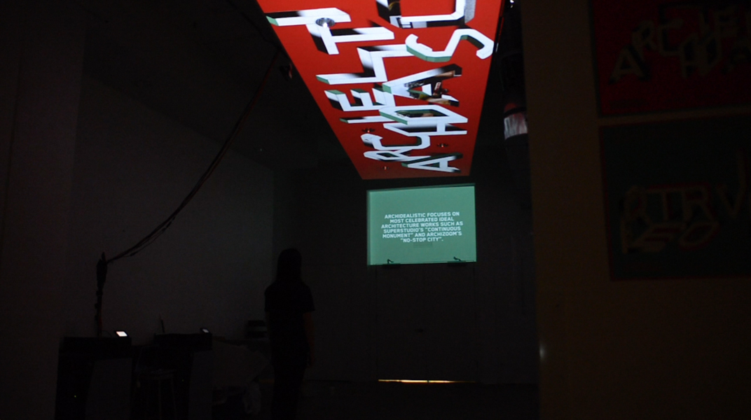
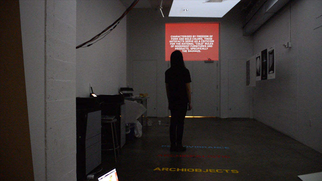
An interactive spatial concept exhibit that is an extension of the book was also proposed. It is divided into 3 interactive curated segments where people step onto each titled field on the floor and a video will play on the ceiling and the wall:
“Archiobjects” which summarizes the movement’s Anti-Bauhaus, anti-capital statements,
“Archidealistic” showcases the prominent idealistic architecture works of the Radicals Designers,
Retrovibrance focuses on selected objects.
They are known for its ambitious utopian beliefs in which they are against the rationalist rules of Modernism and its Anti-Bauhaus attitude, so looking up is the ideal way to see their narratives.
Thanks:
Brad Bartlett and Miles Mazzie for the direction,
Phil Enzler, and Ivan Cruz for the interactive coding

↑ Archiobjects case study video (Click to play)
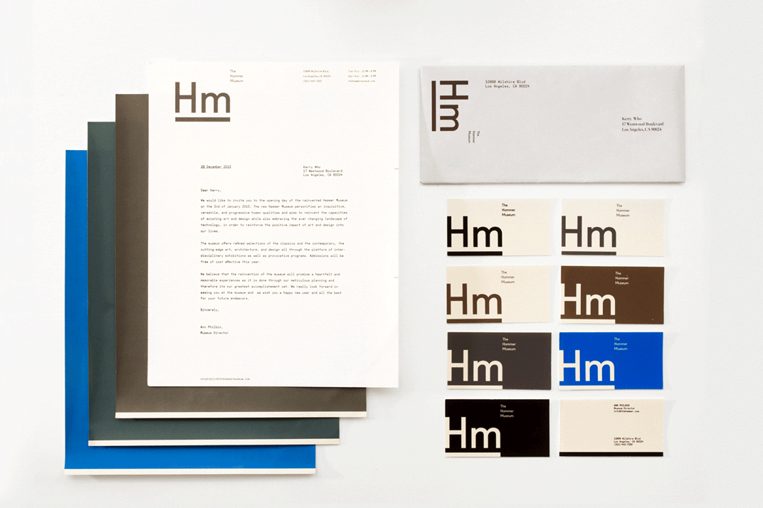
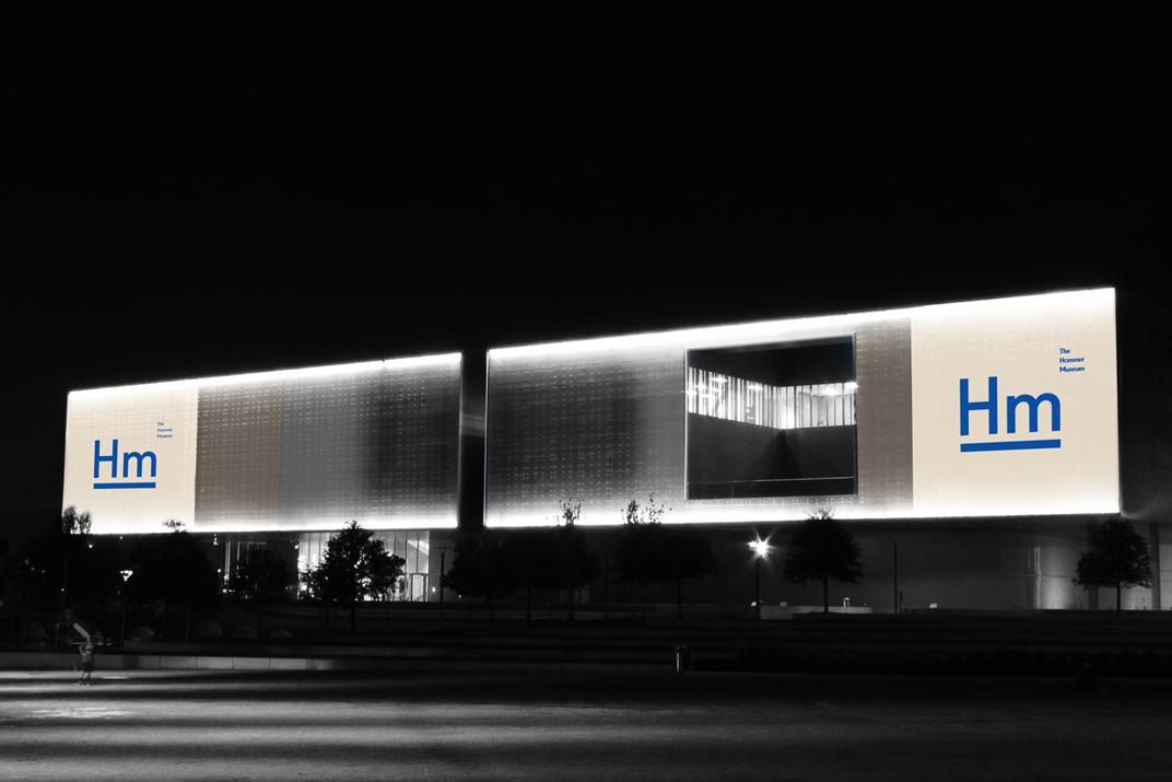
The Hammer Museum
CONCEPT PROJECT – IDENTITY
Spring 2014Done as a student project at ArtCenter College of Design during the course of 14 weeks.
The new identity concept for the Hammer Museum is inspired by the possibility of how language can be interpreted as an art-form to a certain extent. With mainly typographic solution, identity systems and spatial applications are approached in a simple and restrained fashion with a glimpse of levity as designed for the restroom signs or the cafeteria wall.
Instructor: Brad Bartlett


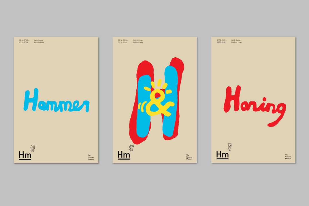
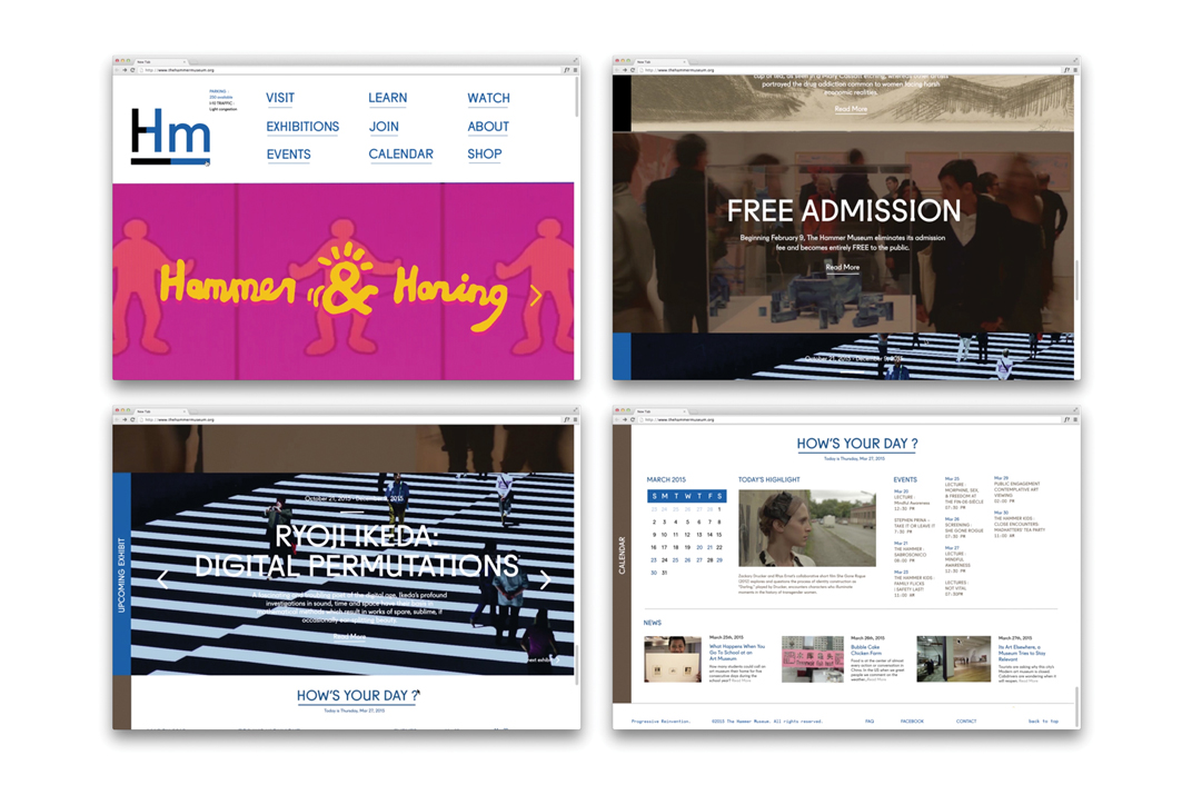
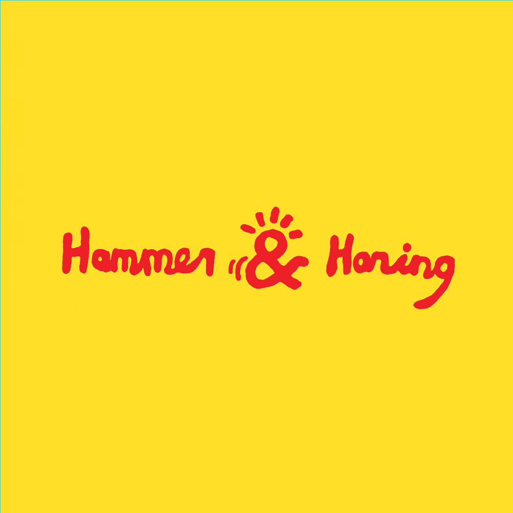
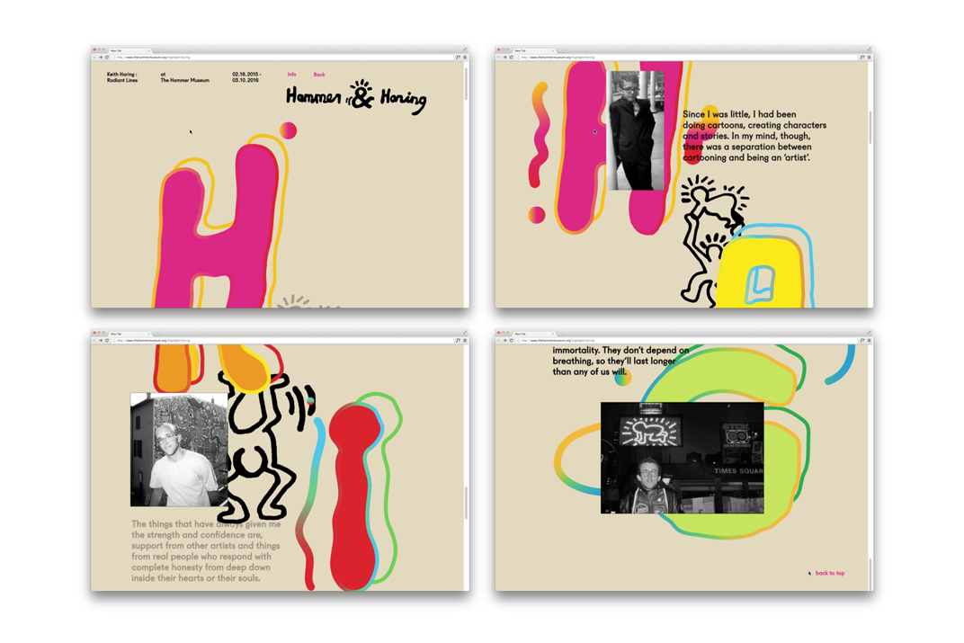
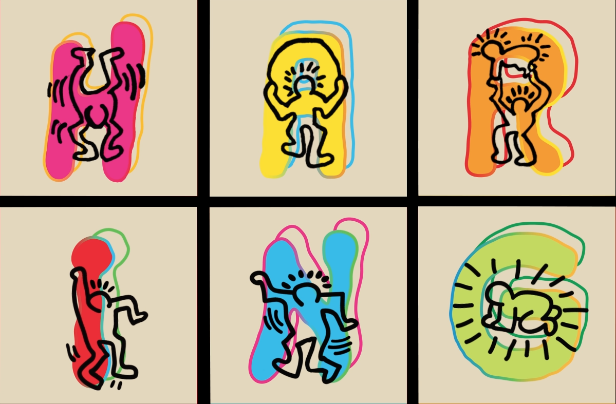
Hammer & Haring: Radiant Lines
This concept exhibit within the rebranded Hammer Museum celebrates Haring’s impact and his advocacy for freedom of expression. Inspired by Haring’s joyful line-work and color palettes, along with his philosophy that ‘art should be for everybody’, this exhibit aims to not only reach out to more diverse audience but also to remind people including you and I, to be happy for who we truly are.


↑ The Hammer Museum case study video (Click to play)
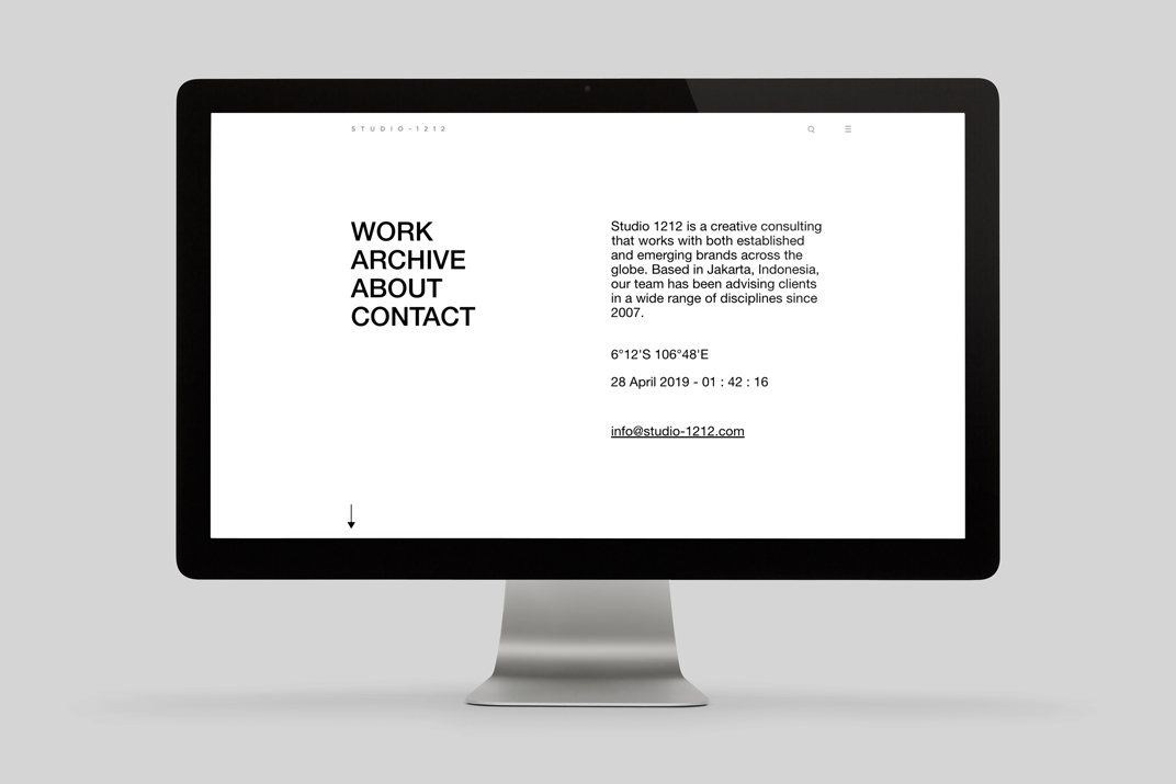
Studio 1212 Credential
WEBSITE
2017Designed with Studio 1212
ROLE:
Worked with a team of creative director, art director and copywriter to redesign Studio 1212 website. Responsible for design development and ensured responsive design across all breakpoints under supervision of art director. Also, created detailed guidelines for web developer.
TEAM:
Creative Direction: Max Suriaganda
Copywriter: Chandra Drews
Web Developer: Mineral Studio


Whiteboard Journal
VISUAL ASSETS FOR SOCIAL MEDIA & WEBSITE
2017-2018Designed with Studio 1212
Whiteboard Journal is an Indonesian online publication established in 2009 for a creative lifestyle community. It focuses on both national and international audience an access to daily news coverage, in-depth reviews and features on the scope of fashion, music, movies, art & design, entertainment, publication, technology, food & drink, travel, culture and general interest.
whiteboardjournal.com
ROLE:
Created on-brand featured articles collages and visual assets for announcement posts on Instagram and website.


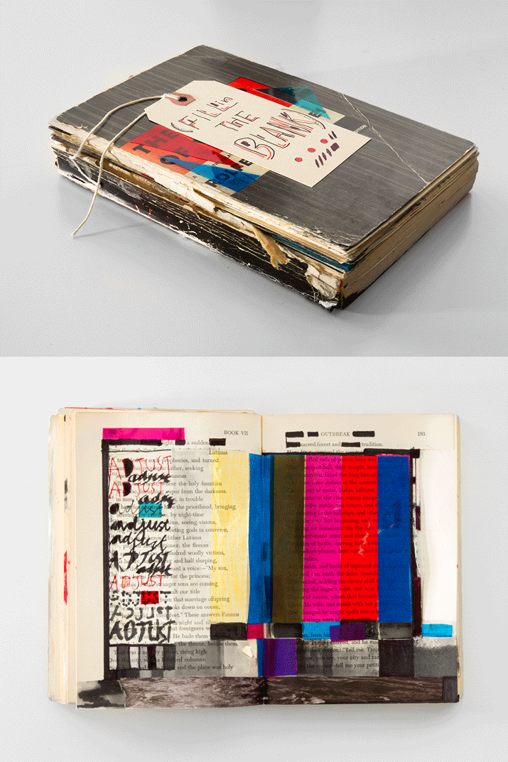
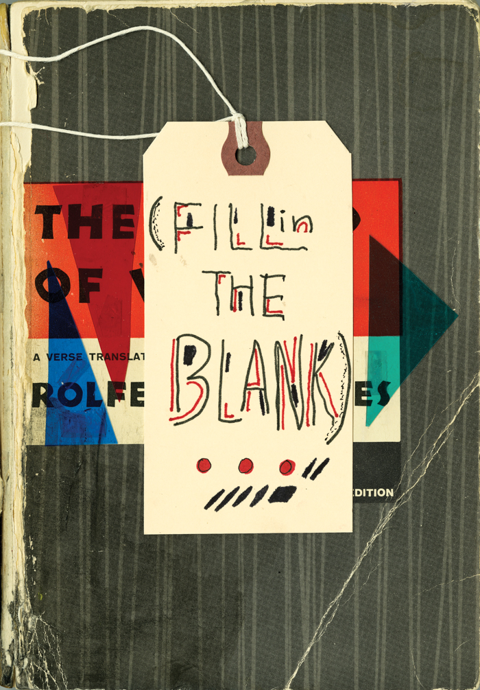
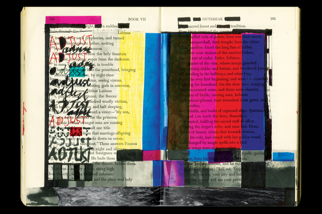
Fill in the Blank
CONCEPT PROJECT
Summer 2012Done as a student project at ArtCenter College of Design during the course of 14 weeks.
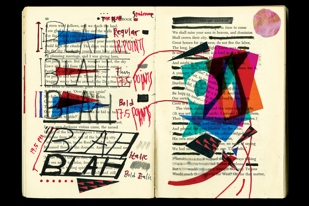
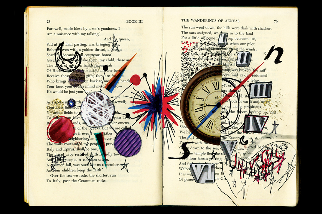
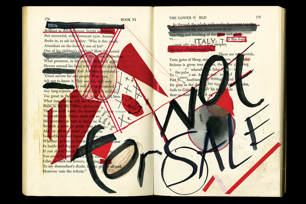
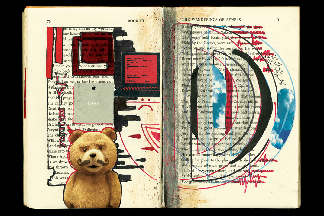
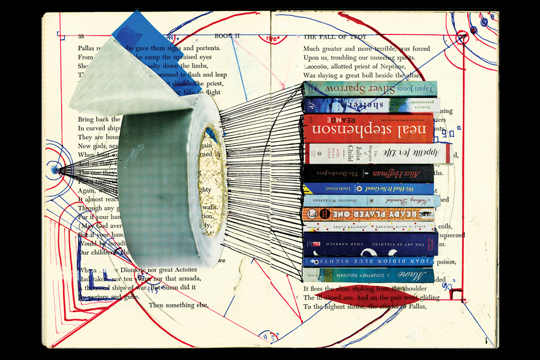
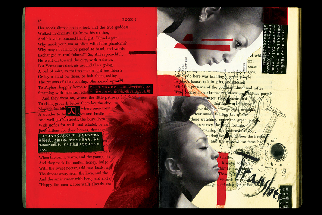
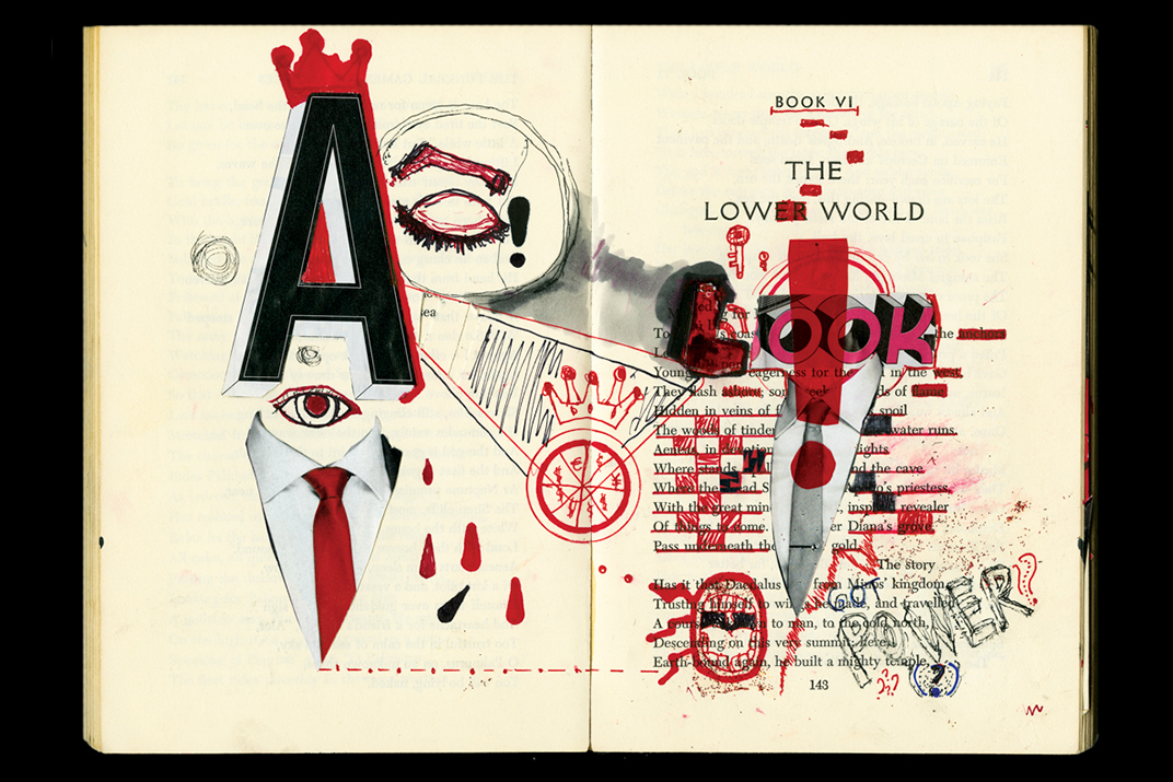
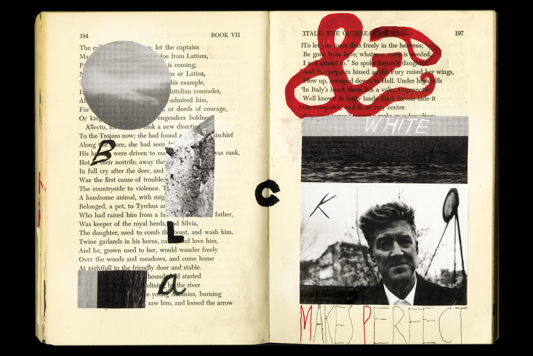
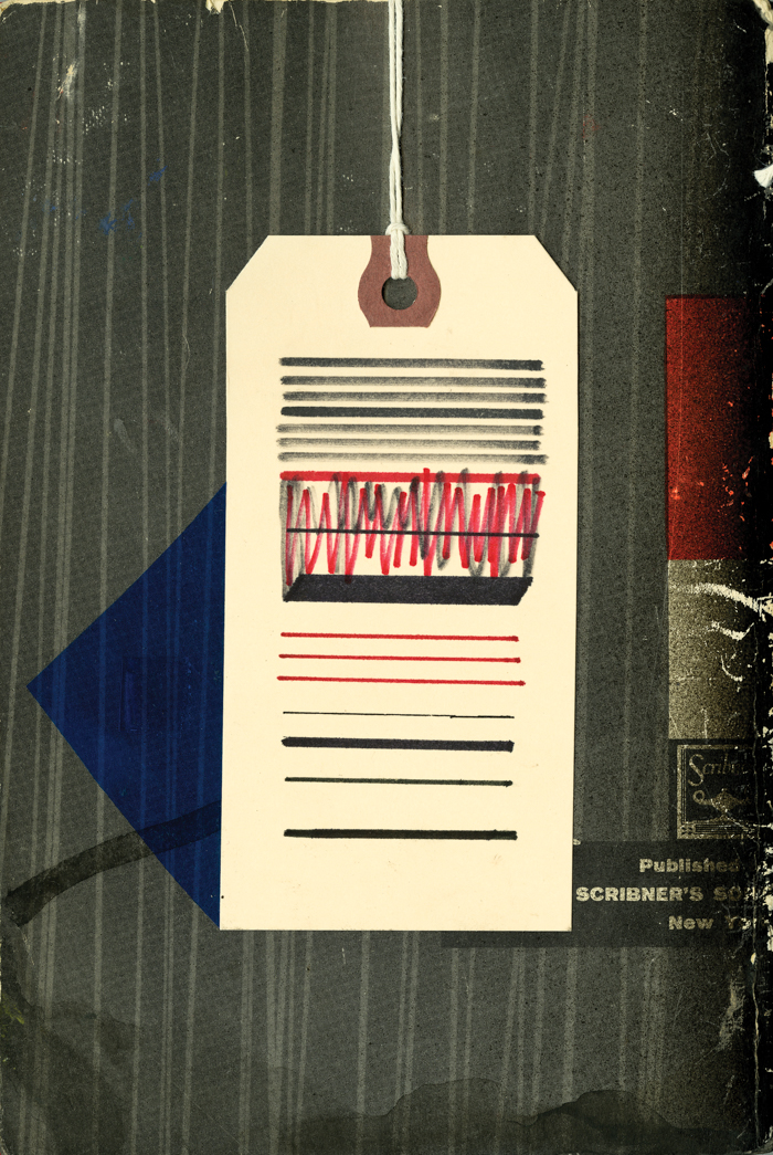
Fill in The Blank, an old worn paperback book that is transformed into a visuals lexicon with non-linear narratives, using various analog techniques like cut and paste, superimposing, drawings, and collaging.

Montage
CONCEPT PROJECT
Summer 2014Done as a student project at ArtCenter College of Design during the course of 14 weeks.
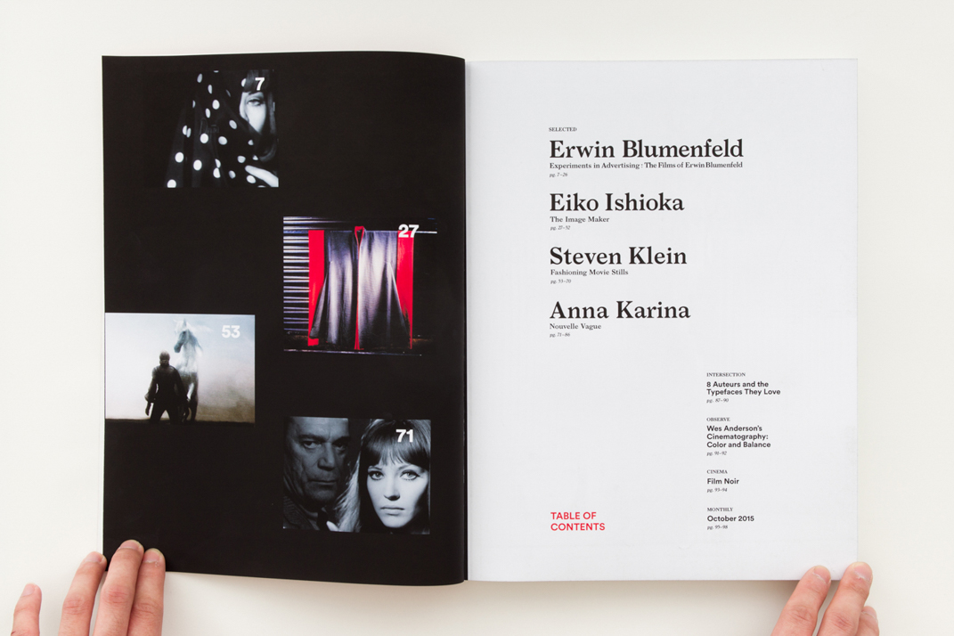
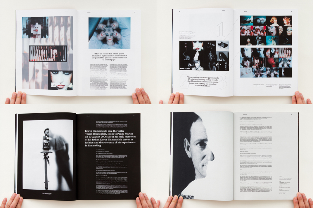
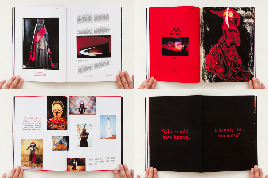
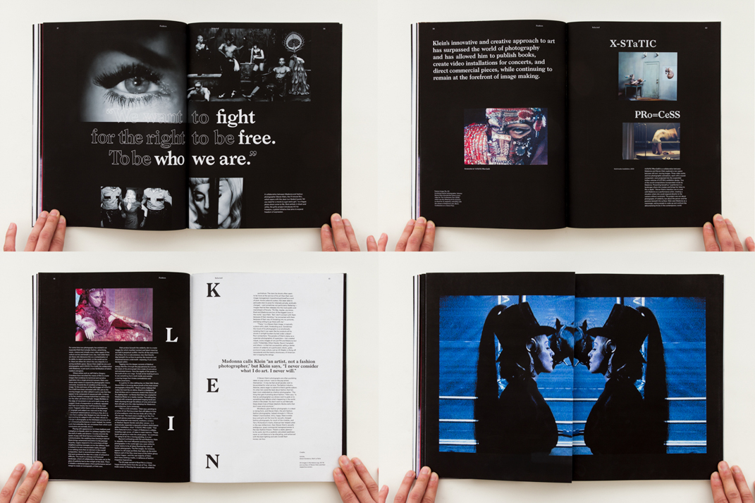
Montage is a quarterly independent publication dedicated to the intersection of moving image and arts. The issue focused on how fashion could manifest itself versatilely within the world of moving image. Featured are Erwin Blumenfeld, Eiko Ishioka, Steven Klein and Anna Karina—all who redefines fashion in moving image in their own iconic ways.